Separating signal from noise in a technical overhaul
Three months into his Product Manager role on a major overhaul, Alex used a functional diagram to clarify the situation and make the right calls on conflicting requests.

That day, I went 10 steps ahead, 3 months after joining the company.
I remember pausing in front of my product functional diagram, looking at the flow of boxes, arrows, and labels I had just finished sketching out. For once, I felt ahead of the curve. Being freshly hired, I often felt left out in conversations, chasing details I didn’t fully grasp and trying to make sense of architectures I couldn’t quite picture. But this time, the diagram was mine, and everything clicked.
That moment came in the middle of a long, exhausting overhaul project. One of those never-ending refactors where the roadmap keeps expanding, new needs keep piling on, and nothing seems truly connected anymore. We were chasing multiple problems at once. The backlog was a blur. We were trying to ship faster, but all we were producing was more noise.
That’s when I decided to try something else.
The mess of inventory, APIs, and misunderstood needs
I’m Alex, a Product Manager at a company that sells refurbished phones. I work on internal apps used by our sales team to optimize stock rotation and place orders for our B2B customers. These use cases were originally handled by a monolithic back-office application that had become too difficult to maintain.
Before I joined, the product & engineering board decided to redesign this back-office app fully using a microservices architecture with AWS, API Platform, and Vue.js. Our team is building the microservice meant to provide stock levels to all apps and remove as many synchronized duplicated stocks as possible.
The real breaking point came when requests started piling up in our backlog faster than we could handle them. Those requests were coming from people asking for significant changes that I hadn’t seen coming. Everyone was so excited about the microservices redesign that the roadmap became packed with interdependent projects. That shouldn’t have come as a surprise: stock is the lifeblood of a refurbishing company, especially when it has to flow seamlessly across so many channels (B2B, B2C, e-commerce, and marketplaces). Our backend and API are what keep that flow alive.
One day, two Product Managers came to me with the same request for an API endpoint. They wanted to know if it was ready—or when it would be. From experience, I know that when two people ask for the same feature but with different use cases, they’re rarely asking for the exact same thing. The usual scenario is realizing this too late and ending up rushing to do the work twice (or more) in the same timeframe, often at the expense of quality. I decided to avoid that familiar blind spot.
Shifting the conversation and finding the real problems
Let me backtrack a bit to explain how I arrived at the functional diagram. A typical use case for our customers is a product swap, meaning they ask to have their phone replaced.
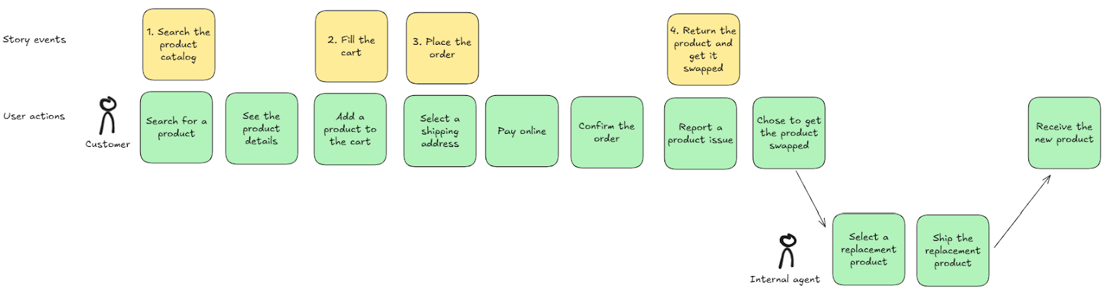
The functional diagram for this use case is the following:
- The Product returns app is not running in a production environment yet. It is an interface still in development (using a dummy stock database) that internal agents will eventually use to handle customers’ swap requests. Most of swap requests are processed automatically, but when the system can’t find a suitable replacement, the agent has to pick an alternative that’s in stock and make sure the client will accept it.
- The Order manager is an API that is running in production. It handles orders coming from all channels (marketplaces, direct ecommerce websites, manual B2B orders), including swap orders. Its role is to send preparation slips to warehouses and to trigger stock decrementation based on those orders.
- Warehouse systems are external. They receive the preparation slips and use them to trigger order preparation on the warehouse side.
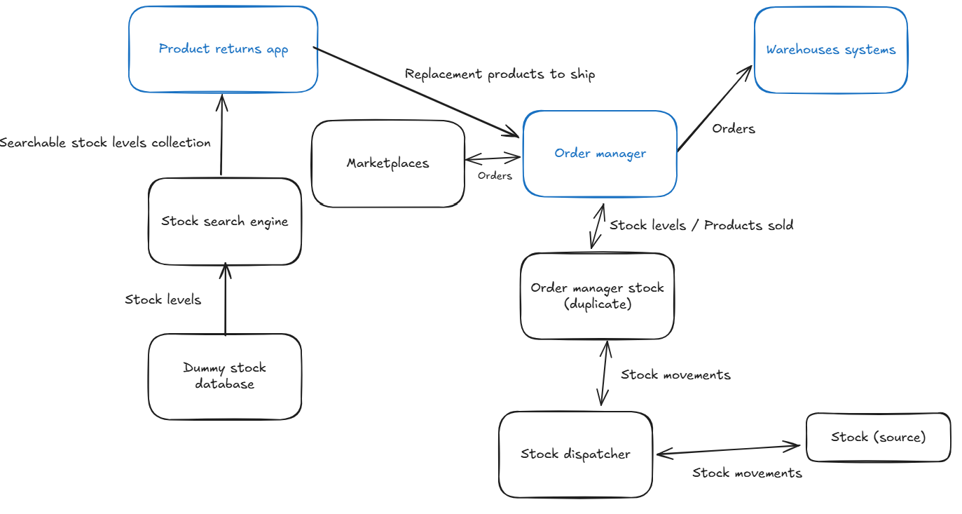
Back to our Product Managers situation. I started with a single question: “What exactly are we trying to do for our clients?” I drew what they wanted:
As I had anticipated, both relied on mostly the same functions, but the goals, the impact, and the system constraints weren’t the same. Same functions, very different stakes.
- PM A wanted to keep building her new app. Her users needed a quick, searchable stock database.
- PM B wanted to start a new project. His team wanted to stop maintaining a stock database as the Order manager was not built for that purpose.
Suddenly, the diagram made these distinctions visible. We could ask, “Which function is this project meant to improve?” And if the answer wasn’t clear, it forced us to think harder and tie our work to real outcomes, not just technical debt cleanup.
It also helped us prioritize. “If we do this first, the scope stays small, but the technical learnings will help with the second topic. So we’re making progress on both, with less risk.” The diagram became a way to shrink scope intelligently and regain control.
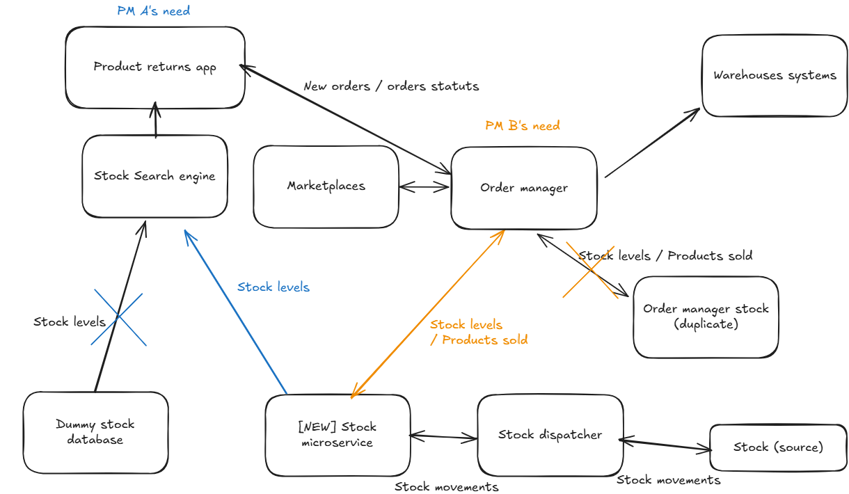
During this discussion, here is what happened:
- PM A thought she needed to decrement stock, but she realized the Order Manager was taking care of that, so her need was easier than she had expected.
- As PM B went over the diversity of stock operations managed by the Order Manager, it became obvious his request was more difficult than we thought.
Overall, it became obvious that we shouldn’t tackle both projects at once. PM A’s project should go first because it only required minor changes; PM B’s would come next, since it involved deeper work on our endpoints.
This wasn’t just a one-time process tool that I was going to toss aside. It became my “weapon” for clarity. Once the diagram existed, it became easier to explain the strategy to the rest of my team, justify decisions to stakeholders, and avoid endless debates about how things “should” be built.
Instead of getting stuck in technical discussions about APIs and responsibilities, we focused on the flow of value: how stock information should move, when, and why.
A simple but powerful tool, if used with the right intention
Functional diagrams are a clear, visual representation of what the system does from a customer’s perspective, not from the vantage point of our tech stack. No databases, no protocols, no architecture diagrams. I didn’t start with the codebase or the microservices. I started with the flow of value: how stock information should move, when, and why.
Getting broader buy-in wasn’t straightforward. Our culture is deeply tech-centric, and when documentation exists, it usually focuses on how things work, not why they exist or what they’re supposed to deliver. But that’s precisely why the diagram mattered.
As a lean engineering tool, a functional diagram acts as a signal. It cuts through noise and shifts the conversation. It looks simple—so simple that people assume a quick chat will achieve the same clarity. It never does. That assumption is what keeps teams misaligned for months.
For us, this diagram became the opposite of that. It gave us a way to step beyond implementation details and reach genuine shared understanding. It now lives at the center of my product obeya and anchors every important discussion.
And honestly? Realizing that not everyone was clear on why they were doing things, how the system worked, or what alternatives were possible—that moment felt damn good. Not bad for someone who had only been in the company for three months.